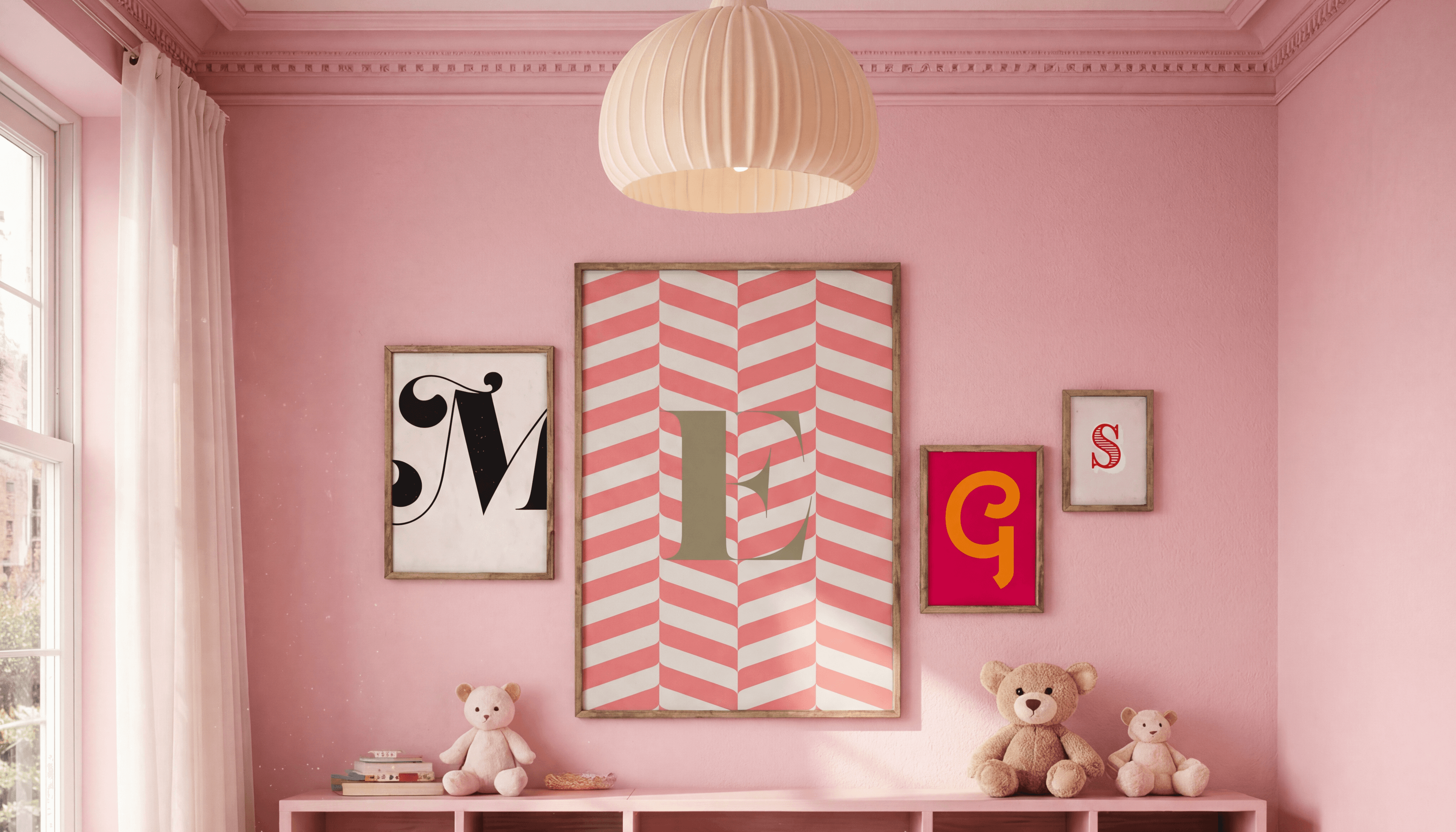
Artwork for nursery walls: Creating personalised, considered spaces

James Eltherington
Founder & Designer
13 April 2026 · Updated 28 April 2026
James founded TypePosters in 2015 and leads the studio's design. He started it on a simple belief — that your walls deserve something more considered than a mass-produced print — and still has a hand in every design that leaves the studio.

Designing a nursery is often about balance. You want something that feels calm and considered, but still personal enough to make the space feel like it belongs to someone.
That’s where personalised wall art comes in. Rather than choosing a single print, you can build a composition using letters, names and numbers, combining different styles, sizes and colours to create something that feels unique to your space.
The result is something that looks thoughtful and put together, rather than bought off the shelf.
Why personalised typography works in nurseries
Typography sits in a useful middle ground. It can be expressive, but it doesn’t overwhelm the room.
A single initial above a cot feels simple and quiet. A full name built across multiple prints adds presence without needing illustration or character-led artwork.
Because each piece is individual, you can scale the layout up or down depending on the space, rather than being locked into one format.
You're not choosing a poster. You're building a wall.
Because each print is sold individually, you can:
- Combine different letters to form names or initials
- Mix sizes to create hierarchy
- Layer styles to add variation
This is what gives the final result that “considered” feel.
Pairing ideas that work well
Same style, different letters (clean and minimal)
Using one design across multiple letters creates a very calm, cohesive look.
Best for:
- Smaller nurseries
- Minimal interiors
- Neutral colour schemes
Mixed styles, consistent colour (balanced but interesting)
Different designs can work together if the colour palette is aligned.
Best for:
- More expressive rooms
- Spaces that still need control and balance
Bold and soft contrast (focal point approach)
Use one large, bold print (A1 or A0), supported by smaller, softer pieces.
This creates a focal point while keeping the overall feel calm and considered.
Traditional and contemporary mix
Combining a more classic style with a modern graphic piece can add depth without feeling overly styled.
One or two contrasting pieces is usually enough.
Sibling sets (personal but cohesive)
For shared rooms or growing families:
- One letter per child
- Consistent spacing
- Either matching or complementary styles
This keeps things cohesive while still feeling personal.
Choosing sizes and creating structure
Size does more than fill space. It creates structure.
- A4 / A3 – ideal for gallery walls
- A2 – a balanced middle ground
- A1 / A0 – strong focal points above beds or cots
Mixing sizes is often what makes a layout feel designed rather than accidental.
Using the wall designer
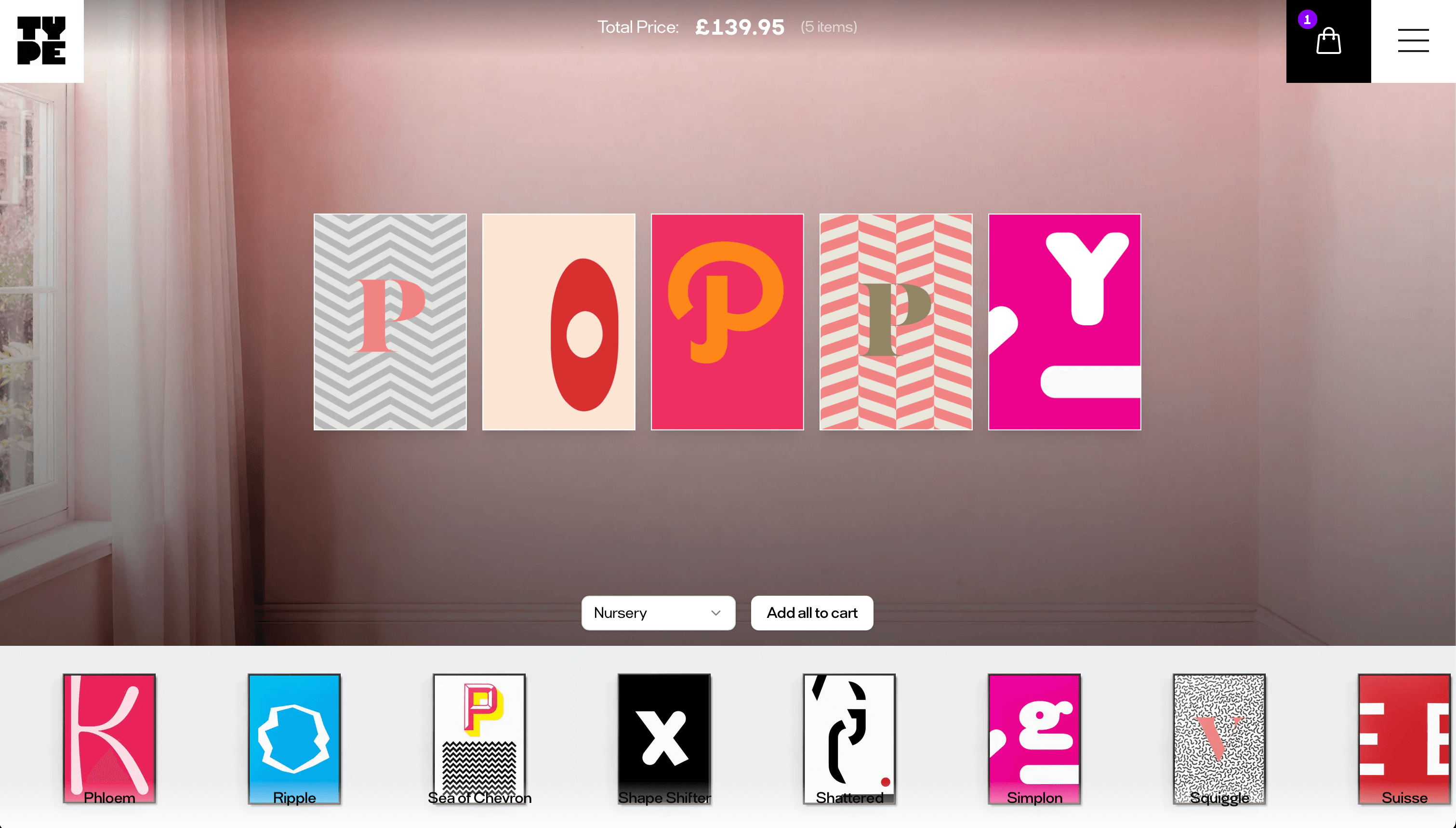
If you’re not sure how things will work together, it helps to see it.
You can experiment with layouts, sizes and styles using the wall designer on our website.
This allows you to:
- Test different letters and combinations
- Explore layout ideas
- Build something that feels right before committing
Final thoughts
Good nursery wall art doesn’t need to be complicated.
By combining a few well-chosen pieces, you can create something that feels personal, balanced and considered.
Start with one idea, then build around it. Keep the palette consistent, vary the scale, and let the composition evolve.
Explore the collections