Wall art for family rooms: Creating personalised spaces that feel considered

James Eltherington
Founder & Designer
15 April 2026 · Updated 16 June 2026
James founded TypePosters in 2015 and leads the studio's design. He started it on a simple belief — that your walls deserve something more considered than a mass-produced print — and still has a hand in every design that leaves the studio.

Family rooms are where everything happens. They’re shared spaces, used by different people, at different times, for different reasons.
That makes them harder to design.
You want something that feels put together, but not overly styled. Personal, but not cluttered. Something that reflects the people in the room without overwhelming it.
Personalised typography offers a way to strike that balance. By combining individual prints, you can build a layout that feels intentional, flexible and unique to your space.
Why family rooms benefit from personalised wall art
Unlike bedrooms or nurseries, family rooms aren’t built around one person.
They need to:
- work for everyone
- evolve over time
- feel cohesive
Using individual letter and name prints allows you to build something that reflects multiple people while still holding a clear visual structure.
A single initial might represent a person. A group of prints might represent a family.
The meaning is simple, but the result feels considered.
Think in layouts, not single pieces
The biggest shift is moving away from choosing one large artwork.
Instead, think in terms of composition:
- multiple prints
- varied sizes
- controlled spacing
This gives you far more flexibility, especially on larger walls where a single piece can feel either too small or too dominant.
It also allows you to adapt the layout over time, adding or changing pieces without starting again.
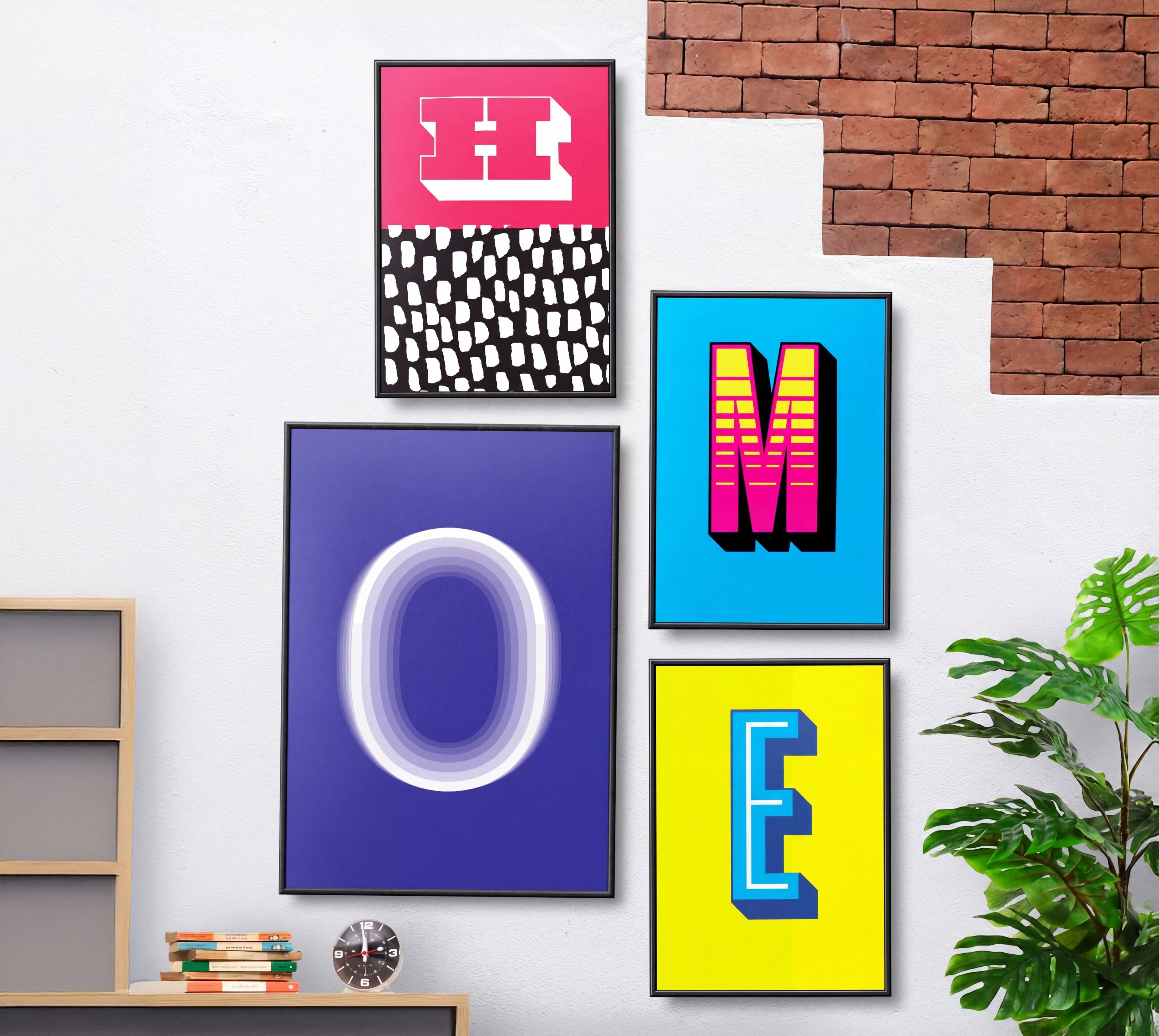
Pairing ideas for family spaces
Family rooms tend to sit somewhere between structured and relaxed. These combinations work well.
1. Structured grid (clean & balanced)
Using the same style across multiple letters creates a strong, ordered layout.
Best for:
- modern interiors
- symmetrical walls
- above sofas or media units
This approach keeps things calm while still feeling intentional.
2. Mixed styles, unified palette
Different designs can work together if the colour palette is consistent.
For example:
- one bold, graphic letter
- one softer, tonal piece
- one more minimal form
Keeping colours aligned prevents the wall from feeling chaotic.
3. One focal point, supporting pieces
Use a larger print (A1 or A0) as the anchor, then build around it with smaller pieces.
This works well when:
- the room needs a clear centre
- you want impact without filling the entire wall
4. Family initials layout
A simple but effective approach:
- one initial per person
- evenly spaced
- either matching or coordinated styles
This creates a subtle narrative without being overly literal.
5. Evolving wall (designed to grow)
One of the advantages of individual prints is that you don’t need to finish the wall in one go.
Start with:
- one or two pieces
- play with scale
- be bold with your style
Then:
- add over time
- introduce new styles
- adjust the layout
This keeps the space feeling alive rather than fixed.
Choosing sizes for larger walls
Family rooms often have more wall space to work with.
That means scale matters more.
- A4 / A3 → supporting pieces or gallery builds
- A2 → flexible mid-size
- A1 / A0 → anchors and focal points
Larger sizes help avoid the “floating artwork” problem where pieces feel disconnected from the room.
Using the wall designer
Planning a larger wall can be difficult without seeing it.
You can experiment with layouts, sizes and styles using the wall designer on the site.
It allows you to:
- test combinations
- visualise spacing
- refine your layout before ordering
Especially useful for family rooms where scale and balance matter more.
Final thoughts
Wall art in family rooms doesn’t need to be complicated.
The key is building something that feels intentional rather than accidental.
Start with a simple idea. Keep the palette controlled. Vary the scale. Add over time.
The result will feel more personal, more flexible, and more considered than a single piece ever could.